

In my experience as a user, for a long time I took many things on the web for granted. Translating a page with a single click. Finding screenshots that explain a process step by step. Watching tutorials with captions. Being able to read comfortably without straining my eyes, or navigate a website without getting lost.
All of that felt… normal.
But at some point, that idea of normality started to crack. I began to realize that what felt effortless to me was not effortless for everyone else. That the web I moved through so easily was full of invisible obstacles for many people—people who experience the digital world differently because of visual, auditory, cognitive, motor, or situational barriers.
Accessibility isn’t about edge cases or rare scenarios. It’s about real people. It’s about inclusion. It’s about acknowledging that there is no single “default” user.
That realization was a turning point for me. It made me question what we mean when we say something is “well designed,” especially in educational resources. If learning materials are meant to empower, inform, and include, then who are we leaving behind when accessibility isn’t part of the conversation?
That’s when I came across a concept I hadn’t known before, but that suddenly made everything click: WCAG compliance.
The Web Content Accessibility Guidelines are not just a technical checklist. They are a framework for empathy. They help us design experiences that work for more people, in more contexts, without assuming ability, environment, or technology. They remind us that accessibility is not a nice-to-have, but a fundamental part of quality and responsibility in digital education.
Designing with WCAG in mind means choosing inclusion as the baseline—not as an exception. And once you see the web through that lens, “normal” is no longer about convenience for some, but about access for all.
When “normal” isn’t normal for everyone
For many of us, the web feels intuitive. Pages load, buttons work, content is there when we need it. We move through digital spaces assuming that if we can access something, others can too. But what happens when that assumption is wrong?
A page cannot always be translated if it is poorly structured.
What if the text is embedded in images? What if headings don’t exist, or the reading order makes no sense? For someone relying on translation tools, what looks like a simple page suddenly becomes an unreadable wall.
A screenshot without a text description is invisible to someone using a screen reader.
Imagine following a learning module where every key step is shown only through images. You hear: “image, image, image.” No context. No explanation. How do you learn from something you cannot perceive?
A tutorial without captions excludes deaf users — and not only them.
What about someone learning in a noisy environment? Or an adult learner watching a lesson late at night, trying not to wake the family? Captions aren’t a special feature; they’re a bridge.
Low-contrast text can be unreadable for someone with low vision — or simply for an adult learner who is tired after a long day.
How many times have we blamed ourselves for “losing focus,” when the design itself is fighting against our eyes?
These are not extreme scenarios. They are everyday situations. And yet, they often remain invisible to those who don’t encounter them personally.
In education — and especially in adult education — these barriers matter even more. Adult learners bring different contexts, responsibilities, energy levels, and abilities. They may be juggling work, family, stress, fatigue, or learning in a second language. When accessibility is overlooked, the message they receive is subtle but powerful: this wasn’t designed with you in mind.
So we have to ask ourselves:
- Who can access this content easily?
- Who has to struggle — and why?
- And who gives up before we even notice?
This is why accessibility is not about convenience.
It is not about adding extra features “just in case.”
It is about real access to learning. It is about dignity. It is about inclusion.
When we design educational resources with accessibility in mind, we are not lowering standards — we are raising them. We are acknowledging that “normal” is not universal, and that good design starts by making room for difference.
Because learning should never depend on luck, perfect conditions, or invisible effort. It should be accessible by design.
So… what exactly is WCAG compliance?
WCAG compliance means designing digital content in a way that does not assume a “perfect” user, a “perfect” device, or a “perfect” environment. It means following the Web Content Accessibility Guidelines (WCAG), an international set of standards developed by the World Wide Web Consortium (W3C), to ensure that learning experiences are usable by real people in real situations.
At its core, WCAG is not about rules for designers or developers. It is about reducing friction. It is about removing unnecessary obstacles between a learner and the knowledge they are trying to access.
In practical terms, WCAG provides a shared language for good design decisions. It encourages clear structure, meaningful content, and flexible ways of interacting with information. A page that can be navigated with a keyboard. Text that can be resized without breaking the layout. Instructions that do not rely on color alone. Media that communicates its message even when sound or visuals are unavailable.
None of this is exotic or complex. It is thoughtful design.
WCAG is built around a simple but powerful idea: digital content should be perceivable, operable, understandable, and robust. Not just for some users, but across different abilities, devices, technologies, and contexts. Especially when those contexts are unpredictable.
Why it matters (more than it seems)
When people hear the word accessibility, they often think of disability as something distant or exceptional. But in learning environments, accessibility is deeply tied to everyday realities—especially for adult learners.
Consider someone returning to education after many years. They may be motivated, curious, and capable, but unfamiliar with modern digital interfaces. A platform filled with hidden menus, unclear labels, or inconsistent navigation can quickly become discouraging. The problem is not the learner’s ability. It is the design.
Or think about learners using older devices or unstable internet connections. Heavy animations, poorly optimized pages, or content that only works with the latest technology can turn learning into a frustrating waiting game. Accessibility standards encourage lighter, more resilient experiences that work even when conditions are not ideal.
What about learning in a second language? Clear headings, predictable structure, and plain language help learners orient themselves and focus on meaning rather than decoding. When content is accessible, comprehension improves for everyone—not just for those with language barriers.
Accessibility also supports people with attention difficulties, cognitive fatigue, or high cognitive load. Long unbroken paragraphs, vague instructions, or inconsistent layouts require extra mental effort. WCAG-informed design promotes chunking, clarity, and repetition where it matters. This is not simplification—it is respect for how people actually process information.
And then there are moments we rarely design for: learning after a long workday, studying while caring for others, revisiting a lesson multiple times, or needing more time without feeling rushed. Features like clear progress indicators, the ability to pause or replay content, and readable text spacing quietly support persistence.
For these learners, accessibility is not a “nice to have.” It can be the difference between staying engaged and giving up. Between feeling capable and feeling excluded. Between accessing education and being locked out of it.
Accessibility as a foundation, not an add-on
WCAG compliance is often misunderstood as a checklist applied at the end of a project. In reality, its greatest value appears when it is part of the design mindset from the beginning.
When accessibility is embedded early, educational resources become clearer, more flexible, and more humane. They adapt to learners instead of forcing learners to adapt to them. They acknowledge diversity without turning it into an exception.
Inclusive design does not dilute learning. It strengthens it.
Because education only fulfills its purpose when it can be reached, understood, and used by the people it is meant for. And WCAG compliance is one of the most practical ways we have to make that happen.ference between continuing a course or dropping out.
WCAG explained without technical jargon
At its heart, WCAG is built on four ideas that are surprisingly simple. You don’t need to write code or understand standards to grasp them — you just need to think about how people actually experience content.
Content should be perceivable
Information must be available in more than one way. If something is communicated visually, there should be another way to access that meaning. If it relies on sound, there should be a visual alternative.
This is about making sure nothing essential is locked behind a single sense.
In practice, this looks like images that are explained in words, videos that can be followed without sound, and text that doesn’t disappear into the background because of poor contrast or tiny fonts. When content is easy to perceive, learners can focus on understanding — not on deciphering.
And the benefit goes far beyond disability. It supports people learning on the go, revisiting material late at night, or simply dealing with visual fatigue after a long day.
Content should be usable
Access is not only about seeing or hearing — it is also about interaction.
A learning platform should not require speed, precision, or confidence with complex interfaces. Users should be able to move through content calmly, deliberately, and without fear of “doing something wrong.”
That means navigation that works without a mouse, interactions that do not depend on exact movements, and experiences that respect different rhythms of learning. When usability is considered, learners don’t have to fight the interface — they can concentrate on the learning itself.
For many adult learners, this usability is what turns a digital platform from intimidating into approachable.
Content should be understandable
Good educational content should feel predictable and reassuring.
Learners should not have to guess what a button does, decode unclear instructions, or wonder why the interface suddenly behaves differently. Clear language, logical structure, and consistent patterns help learners build trust and stay oriented.
When mistakes happen — and they will — the system should guide, not judge. Clear feedback and supportive error messages help learners recover and continue, instead of feeling blocked or embarrassed.
For adults returning to learning environments, this clarity plays a crucial role in rebuilding confidence.
Content should work in real-life conditions
People don’t access learning materials in ideal circumstances. They use different devices, different browsers, different assistive tools — sometimes outdated, sometimes imperfect.
Accessible content is resilient. It adapts. It continues to function even when technology, connectivity, or context is not optimal.
This principle reminds us that accessibility is not about designing for a single profile. It is about accepting variability as the norm. When content works across contexts, it respects the diversity of learners’ lives instead of expecting them to fit a narrow model.
WCAG compliance in adult education
Applying WCAG compliance in adult education is not about ticking boxes or complying with an abstract standard. It is about recognizing that learning as an adult already requires effort — and that poorly designed technology can quietly turn that effort into a barrier.
Adult learners do not arrive in educational spaces with unlimited time, energy, or confidence. Many are balancing work, family responsibilities, financial pressure, or past experiences of academic failure. When learning platforms are confusing, inaccessible, or rigid, they don’t just slow people down — they send a message: this space was not designed with you in mind.
Accessibility challenges in adult education are often subtle. They don’t always appear as complete exclusion, but as friction: extra clicks, unclear instructions, content that is hard to follow, interfaces that demand too much attention or precision. Over time, that friction accumulates. Motivation drops. Confidence erodes. Learners disengage — not because they lack ability, but because the environment makes learning unnecessarily hard.
This is why WCAG compliance matters in adult education contexts.
Accessible learning platforms tend to reduce dropout rates because they remove avoidable obstacles early on. When learners can navigate independently, understand expectations clearly, and access content in ways that suit their needs, they are more likely to persist.
They increase learner autonomy. Instead of constantly needing help to find information, replay content, or understand instructions, learners gain control over their own learning process. That sense of control is especially powerful for adults rebuilding trust in their ability to learn.
They also foster trust. When a platform feels predictable, readable, and forgiving, learners feel safer experimenting, making mistakes, and continuing. Motivation grows not from pressure, but from feeling supported.
Perhaps most importantly, accessible platforms create learning environments that feel more human. They acknowledge difference without calling it out. They adapt quietly, respectfully, and consistently. And very often, they simply work better — not just for those we label as “needing accessibility,” but for everyone who interacts with them.
A final thought (and an invitation)
Discovering WCAG compliance changed the way I look at the web. It shifted my perspective from “does this work for me?” to “who else is this meant to work for — and who might it be excluding?”
Accessibility, I’ve learned, is not a technical afterthought. It is a design mindset rooted in inclusion, education, and respect. It asks us to slow down, question assumptions, and design with intention.
This article only scratches the surface. It introduces what WCAG is and why it matters, especially in adult education. The real work begins after reading.
So here’s the invitation: explore the guidelines. Look at your own content with fresh eyes. Test it differently. Ask yourself who might be struggling quietly, without ever telling you.
Because an accessible website is not a “special” version of the web.
It is simply a better one — for learning, for teaching, and for the people we design for.ebsite.
It’s just a better one.
Now…..a bonus
Example 1: Text that is hard to read (poor contrast)
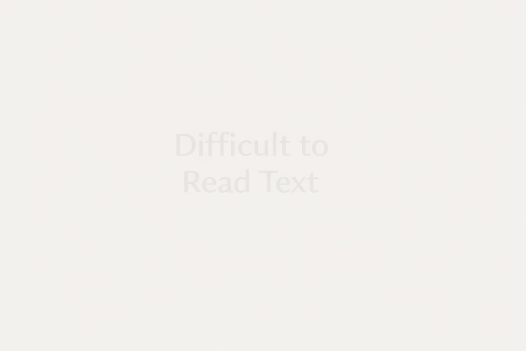
What’s the problem?
- Light gray text on a white background
- Thin fonts with little visual weight
- Text that disappears when there is glare or eye fatigue
Why this matters (WCAG):
People with low vision, older adults, or anyone reading after long hours may struggle to read this text — or not read it at all.
WCAG principle involved: Perceivable
WCAG requires sufficient color contrast so text can be read comfortably.
Example 2: Text over images (looks nice, works badly)
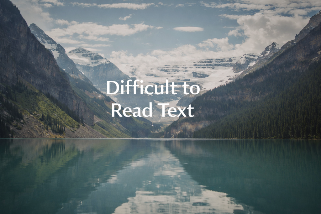
What’s the problem?
- Text placed directly over busy images
- No background overlay or contrast control
- Important information lost in the image
Why this matters (WCAG):
If the background changes or the image is complex, the text becomes unreadable — especially for people with visual impairments or cognitive overload.
WCAG principle involved: Perceivable & Understandable
Example 3: Small text and tight spacing
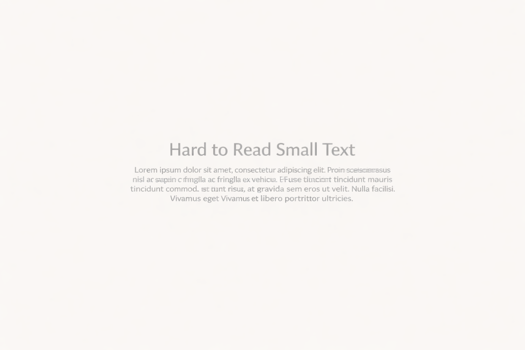
What’s the problem?
- Very small font size
- Lines too close together
- No breathing space between paragraphs
Why this matters (WCAG):
Adult learners, people with dyslexia, or users with tired eyes may find this exhausting or impossible to read.
WCAG principle involved: Perceivable
WCAG encourages readable font sizes and spacing that supports comprehension.
Example 4: Text used as an image

What’s the problem?
- Important text embedded inside images
- No alternative text
- Cannot be resized, translated, or read by screen readers
Why this matters (WCAG):
Screen readers can’t read it. Translation tools can’t translate it. Zooming doesn’t help. For many users, the content simply doesn’t exist.
WCAG principle involved: Perceivable & Robust
Example 5: Long blocks of text with no structure
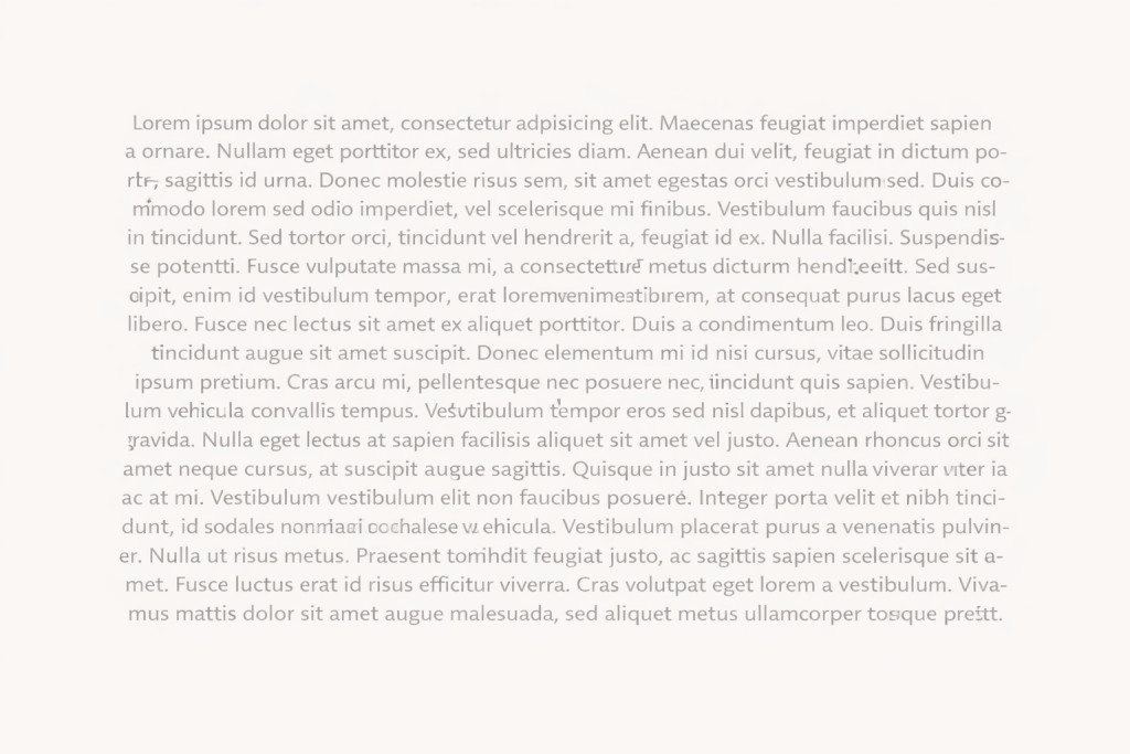
What’s the problem?
- No headings or subheadings
- Long paragraphs
- No visual hierarchy
Why this matters (WCAG):
Screen reader users rely on headings to navigate. Adult learners rely on structure to understand and remember information.
WCAG principle involved: Understandable & Operable
Why these examples matter in adult education
All of these issues appear constantly in:
- Online courses
- Learning platforms
- PDFs and presentations
- Educational websites
And they disproportionately affect adult learners, who may have:
- Visual fatigue
- Lower digital confidence
- Cognitive overload
- Older devices or screens
Fixing these issues doesn’t just help “accessibility users”.
It makes learning clearer, calmer, and more humane for everyone.


